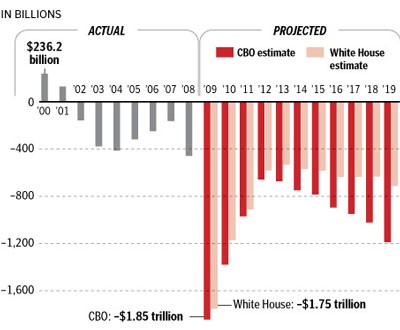
 The graph shows the Bush administration debt in gray versus the projected Obama administration debt in red. It is not a pretty picture.
Hat tip photo and full story: Herttage Foundation.
 The graph shows the Bush administration debt in gray versus the projected Obama administration debt in red. It is not a pretty picture.
Hat tip photo and full story: Herttage Foundation.
You can now reach BitsBlog at bitsblog.com!
BitsBlog is proud to be a part of The Conservative Reader